PRODUCT PORTFOLIO: 1. LEARN
I learn about my customer.
Building a good product is an exercise in empathy: if you can’t feel your customers’ pain points, you’re not going to build them the right product. To understand my customer, I utilize a combination of qualitative and quantitative methods:
Speaking to customers
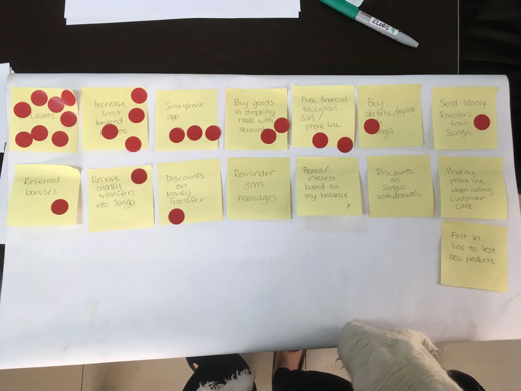
I’ve called up customers, invited them to lunch, organized focus groups, and answered customer service queries—all to learn more about how customers use my product.
Pictured: Feature ranking exercise during a focus group for Zoona Sunga. We learned that our savings customers didn’t know about our existing credit product, so we then increased our communications on this topic on multiple channels (social media, SMS).
Leading UX tests
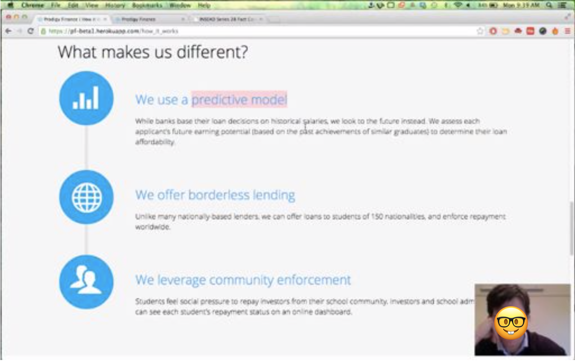
I’ve conducted and scripted several user tests, so I know how to moderate them, take notes, and identify important obstacles.
Pictured: I led user testing of the new Prodigy Finance website. Here is a screenshot of a user test with an (anonymized) customer. During these sessions, we learned many things, including that the FAQs were not prominent enough.
Building personas
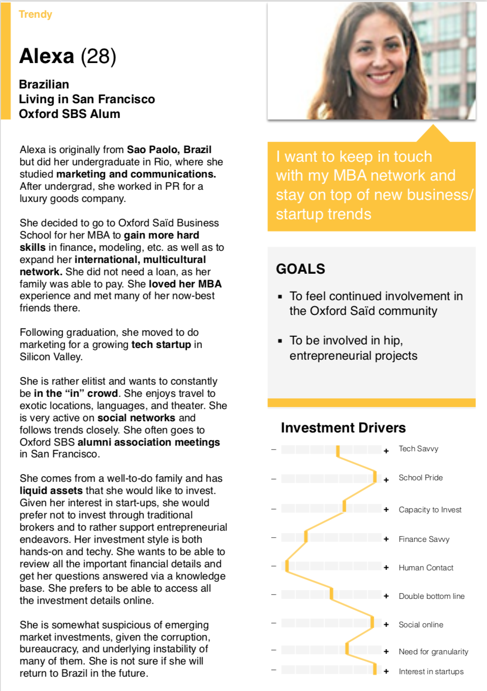
I create clear customer profiles and map them to user journeys, so that the whole team can build with these personas in mind.
Pictured: Two of our four investor profiles for Prodigy Finance. After creating the personas, we mapped out their likely user journey through our old website, and then mapped out an ideal journey through a better, redesigned website.
Digging into data
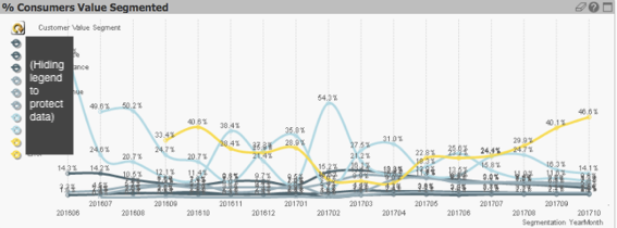
I comb through analytics and transactional data, looking for patterns and segmenting customers to provide better targeted experiences.
Pictured: For Zoona Sunga, I segmented customers based on value to the company (so we could focus on retaining high value customers) AND on behavior (so that we can provide different kinds of nudges to each segment). In other analyses, I analyzed people’s transactional cadence, to predict if they were in danger of churning.
I also learn about the wider context.
That means understanding the market opportunities; the competitor landscape; the regulatory constraints; and the relevant behavioral nudges / UX principles to improve acquisition, retention, or revenue.
Here are two examples where understanding broader context mattered:

Downloadable Fact Cards
In 2014, Prodigy Finance was effectively a peer-to-peer student loans platform. Graduate students would get loans funded by alumni investments. At the time, our main obstacle was getting enough investment. In speaking to some alumni, we learned that one key problem is that we lacked the typical downloadable PDF Fact Card common to most investments, which made Prodigy appear unprofessional and non-transparent.
I downloaded 30+ different fact sheets from institutions around the world, to better understand best practices and to design a Fact Card that was professional and informative. I also worked to translate that Fact Card pdf into a webpage, should a potential investor prefer to scan a site than to download a PDF.
Pictured are images of a recent 2-page Fact Card.

Sunga brochures
Sunga is a savings account targeted at lower-to-middle income Zambians. Our primary marketing was through community radio, social media, and physical brochures and posters. The brochure was particularly tricky to design because of English literacy rates. (Designing it in the major African languages was also a no-go because, if someone is literate, they were taught to read/write in English, not in an African tongue.)
So to design the brochure, I read scholarly research on designing materials for less-literate audiences. There was a lot of literature from the health sector, e.g. to teach people the importance of washing your hands. I learned, for example, that some seemingly universal symbols (like the circle with a slash in a “No smoking” sign) does not translate in many places. Indeed, we tested it, and a red X was much clearer to Zambians.
The rest OF MY PRODUCT PORTFOLIO:

PORTFOLIO INTRO

1. LEARN

2. DESIGN & BUILD

3. LAUNCH

4. OPTIMIZE